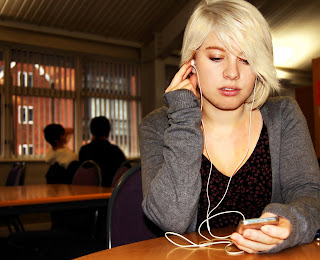
This is my first draft of my front page. I used a mid-close up as the front cover page. I decided that this was an appropriate image to use as it is of a student of the correct age and she is listening to music on an ipod, which is one of the things that my target audience wanted in the student magazine. If you have any suggestions on how to make it better, could you please post them to me. Thank you.
Monday, 30 November 2009
Possibly front page image
Weekly review-Week two.
This week i have managed to take a lot of photos that i could possibly use in my magazine. i have also chosen five that i am going to use and posted them on ym blog for people to comment on them. I have also started to use photoshop to edit them and make them look better for the magazine. Finally, i have decided on the name for my magazine, it will be called Catch up.
Thursday, 26 November 2009
Possible pictures for the magazine
Here are some possible picures for the magazine. I will use some for the front cover and some for the context page. The pictures are for different categories within the magazine, such as relationship and music. If you could perhaps tell me which ones you think should/shouldn't be used i would appreciate it.
Monday, 23 November 2009
Photoshoot planning
After looking at the results from my questionnaire, i have decided that my target audience for the student magaazine is 16-17 year olds. I have also decided that the magazine is going to be about: MUSIC, FASHION and COLLEGE/REAL LIFE, based on these results.
I now need to plan a photoshoot for the photo's that will be on the front cover. I will take a wide range of photo's so i have many to choose from, as i am not sure yet as to how many i will have on the front cover. I will also plan the location where i will take the photo's.
Possible ideas for loacations are:
1. The refectory-college life
2. Class rooms ( possibly graphics/photography room)- college life
3. Sofa in costa coffee- realationships
4. Couple walking through garden of rest -relationships
5. People playing guitars etc-music
Weekly review-week one
This week i have managed to get quite a lot down. I've created my action plan which will help me stay organised and focused on the task set. Also, i have managed to analyse two front covers; these have given me ideas for what to use and not use on my own front cover. As well as this i have been able to create a questionnaire for people to fill in and let me know what they want from the student magazine, i will then use the results i get to help me create the front cover. I asked a iwde range of different questions such as: "What font should be used", "What would you like in the magazine" and " What colour scheme should be use". From the result, therefore, i will have a good idea what people want so i will be bale to make a student magazine that fits the criteria people have chosen.
Finally, i have created three design ideas that i feel best fit the theme of a student magazine. I then wrote a small paragraph with each one saying the positives and negatives. Next, i asked people if they could comment on which design they felt would be the best one for a student magazine. While i was doing these, i also commented on other peoples questonnaires and design ideas to let them know what i would want.
I feel that this week has gone rather smoothly and i have had know real problems. I am in front of my action plan so, next i will plan and do my photoshoot.
Thursday, 19 November 2009
design idea 3
Would you mind having a look at my three design ideas and telling me which one you think would best suit the student magazine front cover. Also, would you mind perhaps giving me some tips on how to make it better. Thank you!
This design idea is the most "quirky" of the three, and so could be the most effective for a student magazine because it is the most eye-catching and the magazine will need to be as it is for teenagers and students. However, when the cover has actually been made into this design idea, it may look a little messy and busy, putting people off reading it. This one also has the price on the cover, which is helpful for customers.
Design idea 2
This design is a bit more interesting to look at than design idea 1, so people may be more attracted to it, athough, because the masthead is down the side of the cover, people may not see it properly so may not know the name of the magazine. Also, it may be difficult to add a picture as the space for it is very long and many pictures will not fit. This design idea also has a price on it which is very useful as people will be aware of how much it will cost them.
design idea 1
This is a very simple design template, which will be easy for readers to view. It also is not too busy so readers will be confused and unsure as to what the magazine is about. However, because it is so simple, it may not interest readers as it is not very eye-catching. I will be putting clour to the template though, if do choose to create this one.
Tuesday, 17 November 2009
Target audience questionnaire-what do they want?
Here is a questionnaire that i have made to see what people actually want their student magazine to be like. I would really appreciate it if you could fill it in for me to give me some ideas.
Cars
Sports
College life
Relationships
Other
2. What would be a suitable name for the magazine? Some suggestions below please....
3. What would be a suitable font for the headline? Here are some suggestions below
Headline
Headline
Headline
Headline
Headline
Headline
Headline
Headline
4.What do you think the price should be?
40p
50p
60p
70p
80p+
other
5. What kind of photos would you like to see on the magazine?
Recent events
Iages or photos
Hand drawn
Don't care what the photos are of, you just want lots of them
6. would you prefer a black and white, or a coloured magazine? What colou scheme would you prefer?
Black and white
Colour (Name some colour schemes eg white and pink, blue and yellow)
7. How old are you?
Under 13
13-15
16-19
20+
8. How often do you read magazines?
Every day
Few times a week
Once a week
Once a month
Never
9. What genre of magazine's do you read most?
Music
Sport
Technology
Relationship
Fashion
Other
10. Are you male or female?
Male
Female
Thank you very much for your time, it is much appreciated.
1. What should the student magazine be about?
MusicCars
Sports
College life
Relationships
Other
2. What would be a suitable name for the magazine? Some suggestions below please....
3. What would be a suitable font for the headline? Here are some suggestions below
Headline
Headline
Headline
Headline
Headline
Headline
Headline
Headline
4.What do you think the price should be?
40p
50p
60p
70p
80p+
other
5. What kind of photos would you like to see on the magazine?
Recent events
Iages or photos
Hand drawn
Don't care what the photos are of, you just want lots of them
6. would you prefer a black and white, or a coloured magazine? What colou scheme would you prefer?
Black and white
Colour (Name some colour schemes eg white and pink, blue and yellow)
7. How old are you?
Under 13
13-15
16-19
20+
8. How often do you read magazines?
Every day
Few times a week
Once a week
Once a month
Never
9. What genre of magazine's do you read most?
Music
Sport
Technology
Relationship
Fashion
Other
10. Are you male or female?
Male
Female
Thank you very much for your time, it is much appreciated.
Monday, 16 November 2009
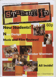
Textual analysis- student ID
This magazinbe is the Ludlow College student magazine, which I found in the student services area in college. It is written by the school council and it costs 60p to purchase. The masthead is very large and covers about a quarter of the front cover, this makes it really stand out, especially as the font used is very unusual. The background uses very bright colours of reds oranges and yellows, this gives the magazine a sense of vibrance and life, similar to the age group at which it is written for.
The coverlines used are in black and white so they stand out clearly from the background, these give you information about what is in the magazine and they try to tempt you to buy it. There are many pictures used on the front of past students, all enjoying themselves while they are busy at work. The pictures are scattered randomly around the page so they magazine doesn't look to formal, a contrast here with the previous magazine I analysed: "Smart talent".
Finally, there is a strapline at the bottom of the magazine which shows more about what else is inside it, however is not in a box or in bold writing so it is alittle difficult to read; it has a good effect though as it adds to the theme of college life that the front cover is trying to put across. The name of the magazine is "Student ID" and this is an effective tittle, in my opinion, because many college students either have their own Id, or fake ID or want some ID, it is a very "hot" topic in colleges.
Textual analysis of "Smart Talent"
This magazine I am analysing I fond in the student services are in college. It costs £2.25 to buy, and it is a career magazine especially published for black and minority ethnic students. The coverlines on the front cover of this magazine are mostly about careers and advice, however there is a headline: the largest coverline, which is anchored to the picture ob the cover.
The picture used is a mid-shot of Miquita and shi is blowing a bubble, the headline reads: " Miquita goes pop." there is a pun used there as she is blowing a bubble, but also because she now wworks for "Pop". The colours used are very plain, white and pink, co they do not distract you from the picture, which is the main attraction of the magazine, as it is very large and in the centre of the page.
The masthead: "Smart Talent" suggests that what youy are going to read is going to be intelligent writing, but also it may be staing that people can be smart and successful at the same time, like Miquita. As well as this, it could also suggest that if you read this magazine you too will be smart and talented. Finally, there is a strapline used at the bottom of the cover which gives information on who published the magazine, this gives it a sense of formality and professionalism.
Action Plan
Week 1:
Set up my blog
Planning and research-existing magazines, target age
Questionnaire-what students want in new magazine
Week 2:
Mock designs-choose which one to use
Organise and do photoshoot
Start design
Week 3:
Continue design
First draft of pages, audience feedback
Week 4:
Finish pages and evaluate
ensure everything is complete and up to standard.
Subscribe to:
Posts (Atom)