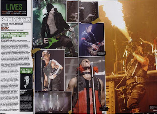
Textual analysis- Double page spread of "Kerrang"
The pages within this double page spread of "Kerrang" are seperated into three columns: one column is text; one column is a collage and the last is one big picture. From this you can therefore see that the picture ot text ratio shows that there are more pictures on this page than text. This is because people find too much tetx on a page daunting and would much prefer to look at pictures, as they are visually stimulating which text is not. The images also add colour to the page, making it more eye-catching to readers.
The text is on the far left hand side and is very small, so more text can be written in. The sub-heading is in a green text box, this gives the article a slight sense of darkness and mystery. Within the collage of pictures there are six meduim to large images used and there is the effect that they are joined together by tape. I feel that this is very effective as it makes it seem like a childs "put-up" board.
The large picture on the far right hand side is of a singer who is breathing fire. This catches your eye as you are on the page and makes you look at teh rest of the images. The colour of the fire is also a contrast of the continual green theme within the page.
Through the whole magazine, double page spreads all have a similar layout in that there is always more images than text on the page. Also, if there is an interview on the page, the image of the person being interviewed is always the main part of the page. As well as this, with an interview, it will usually go over more than double page spread. The colours used throughout the magazine are all very similar, such as burnt orange, grey and black, this is to emphasise that the magazine is a rock magazine so would not use very bright, cheeful colours.
No comments:
Post a Comment